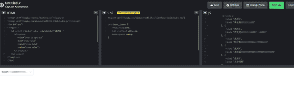
 code前端网
前言
在创建页面的过程中,我们经常需要使用下拉框组件。有时,由于影子根的存在,使用原生 select 标签非常不方便。 Shadow root 有时会给我们编辑样式时带来很大的问题
《ShadowRoot介绍》
在使用元素的下拉菜单时,遇到了选中选项的文字内容过长,三个点无法及时更改的现象。需要再次点击鼠标才能生效(当然,错误仍然是程序员不变的主题)

虽然网上也有其他UI组件,但因为当时我使用的UI元素一般,所以切换到其他UI组件并不方便。
如果没有条件,就只能自己创造,自己丰衣足食。
我也已经写过关于下拉框组件的博客:将下拉框组件自定义为自定义vue
这次我做了一个小小的调整。下拉列表组件现在由两个组件组成
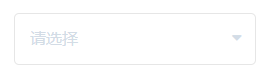
达到的效果:
正文开始
受孕
下拉框组件已准备好分为两个模块:
-
第一个块是用户可以直接看到的内容字段,使用三角箭头
-
第二个块是一个下拉列表,当用户单击包含内容的字段时启动
外层
首先定义外部模块组件wzc-select.vue
旁边的三角形符号是一个font-awesome图形,font-awesome是一个免费的图标字体库
-
使用 npm install font-awesome 下载
-
如果使用 main.js,请添加 import 'font-awesome/css/font-awesome.min.css';
-
如果您使用 CDN,请使用导入链接:
<link href="//netdna.bootstrapcdn.com/font-awesome/4.7.0/css/font-awesome.min.css" rel="stylesheet"> -
使用时,在类中添加直接对应的图形名称,例如
<i class="imgthree fa fa-caret-up" ></i>
这里数据传输的值是由父组件传递给子组件props的值补充的。
如果你想了解如何在组件之间传值,可以阅读这篇文章:《Vue 组件通信的 8 种方式》
使用 props 获取宽度、高度和占位符三个值。您可以使用default来设置默认值。如果外部没有传递值,则使用默认值
props: {
  placeholder: {
    type: String,
    default: '请选择'
  },
  width: {
    type: Number,
    default: 180
  },
    height: {
      type: Number,
        default: 40
    },
}
有些属性是使用:root方法添加的,这里你自己就明白了《:root – CSS》
在 vue 中可以使用计算来设置 styleVar 对象
computed: {
  styleVar() {
    return {
      '--select-height': this.height + 'px',
      '--select-width': this.width + 'px'
    }
  }
}
通过 :style
在 div 中绑定 styleVar<div class="wzc_select" :style="styleVar" >
这样在写下面样式的CSS时就可以直接使用这个宽度和高度了
.wzc_select {
  border: 1px solid #E6E6E6;
  border-radius: 5px;
  height: var(--select-height);
  width: var(--select-width);
  line-height: var(--select-height);
}
外层分为两部分。默认情况下,下面的选择列表下拉列表是隐藏的。
<template>
    <div class="wzc_select" :style="styleVar" >
        <!-- 选择框 -->
        <div class="divSelect" :class="{ 'drop_down': isListShow }" ref="divSelect" >
            <div class="divSelectinput" @click="dropDownSelect">
                <!-- 选中后的内容 -->
                <div class="selectinfos" :title="label" :class="{ 'no_select': label == '请选择' }"> {{ label }} </div>
                <!-- 三角形图标 isListShow判断三角形图标是否旋转 -->
                <i class="imgthree fa fa-caret-up" :class="{ 'is-reverse': isListShow }"></i>
            </div>
        </div>
        <!-- 下拉框列表 -->
        <transition name="drop-down" >
          	<!-- 下拉框列表isListShow来决定是否收起 -->
            <div class="Selectlist" v-show="isListShow" ref="dropDown">
                <div class="select_triangle"></div>
                <ul class="wzc_option_list">
                    <slot name="wzc_option"></slot>
                </ul>
            </div>
        </transition>
    </div>
</template>
如果需要在下拉框点击时添加一些动作效果,可以使用<transition>给下拉框加框。
用CSS编写过渡动画效果
当点击打开弹窗、关闭下拉框时,必须对点击文档做出判断。如果点击的是页面的其他部分,下拉框将会关闭
document.addEventListener("click", function( e ){
  if(_this.$refs.divSelect) {
    if ( !!_this.$refs.divSelect.contains(e.target) || !!_this.$refs.dropDown.contains(e.target) )
      return;
    else
      _this.isListShow = false;
  }
})
经过考虑和操作,外面写的是
让我们使用import 将wzc-select.vue 导入页面。不要忘记在 components 中注册
-
进口:
import wzcSelect from './wzc-select' -
报名:
components:{ wzcSelect } -
致电:
<wzc-select class="wzcs" :width="240" :height="40"></wzc-select>
目前的效果已经有了,但是比较基础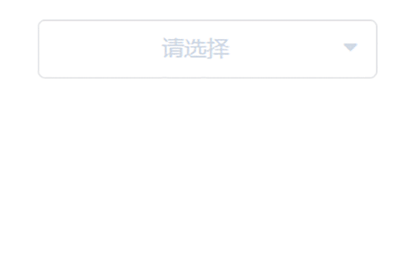
内层
内部代码其实更简单,只需要把外部传过来的数据显示出来即可
<template>
  <li class="wzc_option" :style="styleVar" @click="currentSelect">
    <div class="wzc_option_dropdown_item">{{ label }}</div>
  </li>
</template>
接受 props 和标签内容中的 CSS 宽度和高度属性以及 optionid 属性
props: {
  // 宽
  width: {
    type: Number,
    default: -1,
  },
  // 高
  height: {
    type: Number,
    default: 34,
  },
  // 内容
  label: {
    type: String,
  },
  // id
  optionid: {
    type: String,
   },
},
点击select时,使用$parent将数据传递到外层wzc-select.vue组件
currentSelect() {
      this.$parent.label = this.label;
      this.$parent.optionid = this.optionid;
      this.$parent.isListShow = !this.$parent.isListShow;
}
当然,别忘了导入内部组件import wzcOption from './wzc-option'
外层与内层结合
内层主要是<li></li>的主体。用于外层时,可利用卡槽将内层存放在相应的显示位置
关于老虎机的介绍,大家可以看一下(当然,具体还要慢慢学习):
-
cn.vuejs.org/v2/api/#slo…
-
cn.vuejs.org/v2/guide/co…
在父组件中调用时可以完整添加
<wzc-select class="wzcs" :width="240" :height="40">
  <template v-slot:wzc_option>
    <wzc_option
      v-for="item in showlist"
      :key="item.item_id"
      :label="item.item_name"
      :optionid="item.item_id"
    ></wzc_option>
  </template>
</wzc-select>
使用样本列表作为测试数据
showlist: [
  {
    item_name: "选项00000000000000000000000000000",
    item_id: "0",
  },
  {
    item_name: "选项11111111111111111111111111111",
    item_id: "1",
  },
  {
    item_name: "选项222222222222222222222222222222",
    item_id: "2",
  },
  {
    item_name: "选项33333333333333333333333333333333",
    item_id: "3",
  },
],
好了,现在下拉框的实现效果已经达到了想要的风格

外部代码 wzc-select.vue
<template>
<div class="wzc_select" :style="styleVar" >
<div class="divSelect" :class="{ 'drop_down': isListShow }" ref="divSelect" >
<div class="divSelectinput" @click="dropDownSelect">
<!-- 选中后的内容 -->
<div class="selectinfos" :title="label" :class="{ 'no_select': label == '请选择' }"> {{ label }} </div>
<!-- 三角形图标 -->
<i class="imgthree fa fa-caret-up" :class="{ 'is-reverse': isListShow }"></i>
</div>
</div>
<!-- 下拉框列表 -->
<transition name="drop-down" >
<div class="Selectlist" v-show="isListShow" ref="dropDown">
<div class="select_triangle"></div>
<ul class="wzc_option_list">
<slot name="wzc_option"></slot>
</ul>
</div>
</transition>
</div>
</template>
<script>
export default {
name:'wzc_select',
components: {},
props: {
placeholder: {
type: String,
default: '请选择'
},
width: {
type: Number,
default: 180
},
height: {
type: Number,
default: 40
},
},
data() {
return {
label: '',
isListShow: false,
optionid: ''
};
},
created() {
this.label = this.placeholder;
},
mounted() {
let _this = this;
document.addEventListener("click", function( e ){
if(_this.$refs.divSelect) {
if ( !!_this.$refs.divSelect.contains(e.target) || !!_this.$refs.dropDown.contains(e.target) )
return;
else
_this.isListShow = false;
}
})
},
computed: {
styleVar() {
return {
'--select-height': this.height + 'px',
'--select-width': this.width + 'px'
}
}
},
methods: {
dropDownSelect() {
this.isListShow = !this.isListShow;
},
},
};
</script>
<style scoped>
.wzc_select {
border: 1px solid #E6E6E6;
border-radius: 5px;
height: var(--select-height);
width: var(--select-width);
line-height: var(--select-height);
}
.divSelect {
width: 100%;
height: 100%;
border-radius: 5px;
}
.drop_down {
box-shadow: 0px 0px 6px #709DF7;
}
.divSelectinput {
width: calc(100% - 20px);
height: 100%;
margin: 0 5px 0 15px;
display: flex;
}
.selectinfos {
width: 87.5%;
cursor: pointer;
overflow: hidden;
text-overflow: ellipsis;
white-space: nowrap;
}
.no_select {
color: #D3DCE6;
}
.imgthree {
width: 12.5%;
line-height: var(--select-height);
text-align: center;
transform: rotate(180deg);
transition: all 0.3s;
}
.imgthree:before {
cursor: pointer;
color: #D3DCE6;
}
.imgthree.is-reverse {
transform: rotate(0deg);
}
.Selectlist {
margin-top: 10px;
z-index: 800;
position: relative;
background-color: #fff;
}
.wzc_option_list {
border-radius:5px;
border:1px solid #E4E7ED;
width: 100%;
padding: 3px 0px;
box-shadow: 0px 0px 6px #709DF7;
background-color: #fff;
margin: 0;
}
.select_triangle {
width: 14px;
height: 7px;
position: relative;
left: 15px;
}
.select_triangle::before {
position: absolute;
content: "";
left: 0px;
width: 0;
height: 0;
border-top: 0px solid transparent;
border-left: 9px solid transparent;
border-right: 9px solid transparent;
border-bottom: 8px solid #EBEEF5;
}
.select_triangle::after {
position: absolute;
left: 2px;
top: 2px;
content: "";
width: 0;
height: 0;
border-top: 0px solid transparent;
border-left: 7px solid transparent;
border-right: 7px solid transparent;
border-bottom: 8px solid #fff;
}
.drop-down-enter {
opacity: 0;
transform:translate(0px, -80px) scaleY(0.2);
}
.drop-down-leave-to {
opacity: 0;
transform:translate(0px, -80px) scaleY(0.2);
}
.drop-down-enter-active {
transition: all 0.5s ease-in;
}
.drop-down-leave-active {
transition: all 0.5s ease;
}
</style>
内部wzc-option.vue完整代码
<template>
<li class="wzc_option" :style="styleVar" @click="currentSelect">
<div class="wzc_option_dropdown_item">{{ label }}</div>
</li>
</template>
<script>
export default {
name: "wzc_select",
components: {},
props: {
width: {
type: Number,
default: -1,
},
height: {
type: Number,
default: 34,
},
label: {
type: String,
},
optionid: {
type: String,
},
},
data() {
return {};
},
created() {},
mounted() {},
watch: {},
computed: {
styleVar() {
return {
"--option-height": this.height + "px",
"--option-width": this.width == -1? "100%" : this.width + "px",
};
},
},
methods: {
currentSelect() {
this.$parent.label = this.label;
this.$parent.optionid = this.optionid;
this.$parent.isListShow = !this.$parent.isListShow;
// this.$emit('slot-content', {label: this.label, optionid: this.optionid} );
}
},
};
</script>
<style scoped>
.wzc_option {
list-style: none;
height: var(--option-height);
width: var(--option-width);
}
.wzc_option:hover {
color: #409eff;
font-weight: 700;
background-color: #f5f7fa;
}
.wzc_option_dropdown_item {
height: 100%;
width: calc(100% - 30px);
line-height: var(--option-height);
cursor: pointer;
margin: 0 auto;
overflow: hidden;
text-overflow: ellipsis;
white-space: nowrap;
}
</style>


