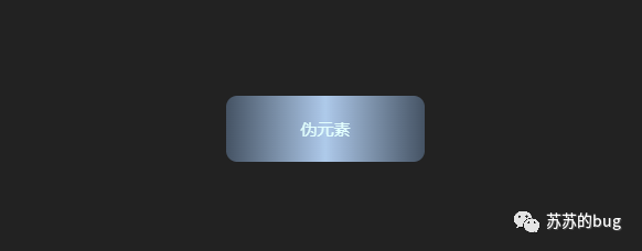
box| 背景被剪切到内容框 origin周围的backgr: Confutse ound -origin 属性指定background-position 属性应该是相对位置。请注意,如果壁纸附件是“固定的”,则此功能无效。 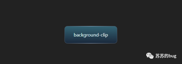 <div class="flex-column j_c">background-clip</div>
div {
cursor: pointer;
position: relative;
width: 180px;
height: 60px;
font-size: 15px;
color: #e2fffd;
transition: all 0.5s ease-in-out;
position: relative;
}
设置背景颜色为边框颜色+元素背景颜色,设置backgr圆origin和backgr外接并设置透明边框 div:nth-child(1) {
--bg: linear-gradient(180deg, #346575 0%, #1a283b 100%);
--border: linear-gradient(270deg, #455364, #aec9e9, #455364);
border: 1px solid transparent;
/* var(--bg)背景色 var(--border)边框色 */
background-image: var(--bg), var(--border);
background-origin: border-box;
background-clip: content-box, border-box;
border-radius: 10px;
}
方法二:伪元素叠加缺点:背景不能透明 - 绘制标签,背景色设置为边框的渐变颜色值,设置相对位置,级别设置为1
<div class="flex-column j_c">伪元素</div>
 div:nth-child(2) {
z-index: 1;
width: 180px;
height: 60px;
border-radius: 10px;
background: linear-gradient(270deg, #455364, #aec9e9, #455364);
}
- 为其添加一个伪元素,将宽度设置为100% - 2px(对应边框的宽度和高度),将背景颜色和级别设置为-1以防止遮挡。内容区域
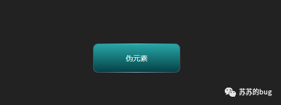 div:nth-child(2)::after {
content: "";
position: absolute;
/* 设置层级为-1,避免遮挡内容 */
z-index: -1;
width: calc(100% - 2px);
height: calc(100% - 2px);
background: linear-gradient(180deg, #27a6a7 0%, #054146 100%);
left: 50%;
top: 50%;
transform: translate(-50%, -50%);
border-radius: 10px;
}
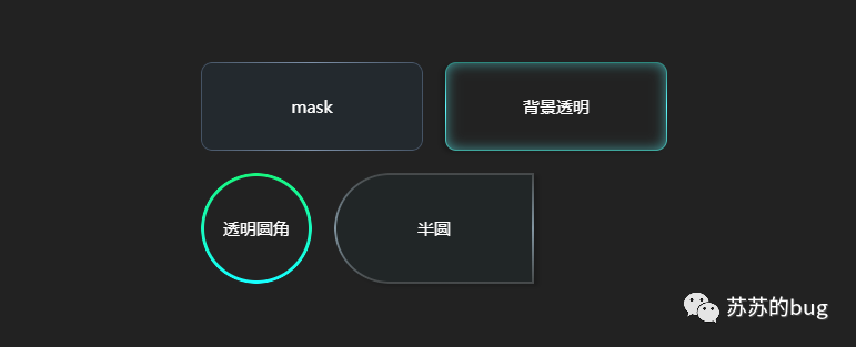
方法三:mask可以实现背景透明,满足用户需求 mask:CSS属性mask允许用户通过覆盖或剪切圆角来隐藏元素某个区域的 CSS 边框。部分或全部可见区域。 mask-image:Mask-image CSS 属性设置要用作元素的遮罩层的图像。默认情况下,这意味着遮罩图像的 alpha 通道乘以元素的 alpha 通道,就像background-image 一样; mask-clip:定义受遮罩影响的区域的 CSS 属性。元素的绘制内容应该限制在这个区域,类似于backgr剪辑; content-box:绘制的内容被裁剪到内容框;填充框:将绘制的内容剪切到填充框内; mask-composite:CSS属性表示当前遮罩层及其下方遮罩层使用的合成功能;标准功能下有4种类型; mask-composite: add; /* 叠加(默认) */
mask-composite: subtract; /* 减去,排除掉上层的区域 */
mask-composite: intersect; /* 相交,只显示重合的地方 */
mask-composite: exclude; /* 排除,只显示不重合的地方 */
-webkit-mask-composite:非标准:此功能是非标准的,不会覆盖标准轨道。 -webkit-mask-composite 属性定义添加到同一元素的多个蒙版图像如何组合在一起。掩码图像的编译顺序与使用 -webkit-mask-image 属性声明的顺序相反。 -webkit-mask-composite: clear; /*清除,不显示任何遮罩*/
-webkit-mask-composite: copy; /*只显示上方遮罩,不显示下方遮罩*/
-webkit-mask-composite: source-over;
-webkit-mask-composite: source-in; /*只显示重合的地方*/
-webkit-mask-composite: source-out; /*只显示上方遮罩,重合的地方不显示*/
-webkit-mask-composite: source-atop;
-webkit-mask-composite: destination-over;
-webkit-mask-composite: destination-in; /*只显示重合的地方*/
-webkit-mask-composite: destination-out;/*只显示下方遮罩,重合的地方不显示*/
-webkit-mask-composite: destination-atop;
-webkit-mask-composite: xor; /*只显示不重合的地方*/
- 定义一个圆角变量--border-radius,边框-宽度--border-width,边框渐变颜色--border-color
div:nth-child(3){
--border-radius: 10px;
--border-width: 1px;
--border-color: linear-gradient(
270deg,
rgba(69, 83, 100, 1),
rgba(126, 145, 169, 1),
rgba(69, 83, 100, 1)
);
}
- 绘制一个div标签,设置宽度和高度,边框半径为- - border -radius ,背景色透明
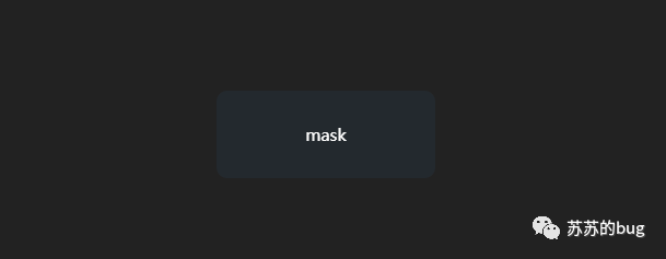 <div class="flex-column j_c">mask</div>
div:nth-child(3){
 width: 200px;
 height: 80px;
 position: relative;
 color: #fff;
 border-radius: var(--border-radius);
 background: rgba(38, 70, 93, 0.2);
 backdrop-filter: blur(10px);
}
- 添加一个伪元素,宽高与主元素相同,圆角设置为--border-radius,padding为--border-width(即边框) size)、背景色 设置 mask、mask-clip 和 mask-composite 合成方法 --border-color
 div:nth-child(3)::after{
content: "";
position: absolute;
left: 0;
top: 0;
width: 100%;
height: 100%;
padding: var(--border-width);
border-radius: var(--border-radius);
background: var(--border-color);
}
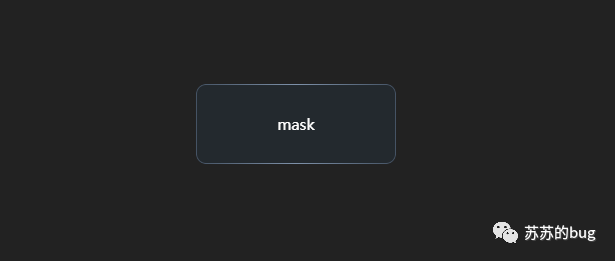 /* 随便定义一个颜色 */
--mask-bg: linear-gradient(red, red);
--mask-clip: content-box, padding-box;
-webkit-mask-image: var(--mask-bg), var(--mask-bg);
-webkit-mask-clip: var(--mask-clip);
/* exclude排除,只显示不重合的地方,Firefox支持4个属性 */
mask-composite: exclude;
/* 只显示下方遮罩,重合的地方不显示 */
-webkit-mask-composite: destination-out;
- 如上通过更改自定义变量创建不同的圆角边框渐变颜色,背景为透明
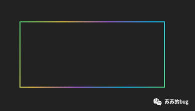
 方法四:边框图像+溢出:隐藏背景可以设置透明,边框内的角不圆角,边框宽度和圆角不能设置为你喜欢的 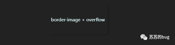 <div class="flex-column j_c">border-image + overflow</div>
div:nth-child(7) {
width: 200px;
height: 100px;
border-radius: 10px;
box-shadow: 4px 2px 4px 0px rgba(0, 0, 0, 0.2);
}
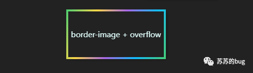 div:nth-child(7):after {
content: "";
position: absolute;
width: 100%;
height: 100%;
top: 50%;
left: 50%;
transform: translate(-50%, -50%);
border: 4px solid;
border-image: linear-gradient(
115deg,
#4fcf70,
#fad648,
#a767e5,
#12bcfe,
#44ce7b
)
2 2;
}
设置overflow:hidden在贴纸上隐藏溢出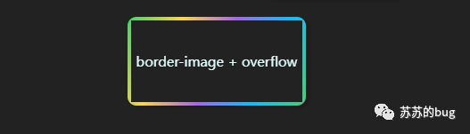 div:nth-child(7) {
overflow: hidden;
}
- 边框的角不是圆角的,宽度边框和圆角宽度不能随意设置
方法五:剪切路径背景可以设置为透明,边框内的角不圆角。边框的宽度和圆角的宽度不能随意设置。 clip-path:CSS 属性clip-path 使用裁剪来创建元素的显示区域。显示该区域的部分内容,隐藏该区域之外的部分。 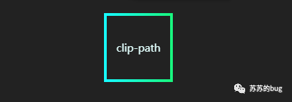 div:nth-child(8) {
width: 100px;
height: 100px;
border: 4px solid;
border-image: linear-gradient(270deg, #18f77f, #17ffff) 1 1;
}
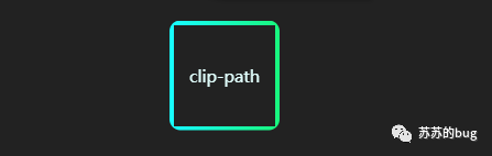 div:nth-child(8) {
clip-path: inset(0 round 10px);
}
- 与方法4相同,边角不圆角,边框宽度和圆角宽度无法设置为您喜欢的
4.激活码<style>
p {
width: 460px;
}
div {
cursor: pointer;
position: relative;
width: 180px;
height: 60px;
margin-bottom: 20px;
margin-right: 20px;
font-size: 15px;
color: #e2fffd;
transition: all 0.5s ease-in-out;
position: relative;
}
div:hover {
filter: brightness(1.3);
}
div:nth-child(1) {
 --bg: linear-gradient(180deg, #346575 0%, #1a283b 100%);
 --border: linear-gradient(270deg, #455364, #aec9e9, #455364);
 border: 1px solid transparent;
 /* var(--bg)背景色  var(--border)边框色 */
 background-image: var(--bg), var(--border);
 background-origin: border-box;
 background-clip: content-box, border-box;
 border-radius: 10px;
}
div:nth-child(2) {
 z-index: 1;
 width: 180px;
 height: 60px;
 border-radius: 10px;
 background: linear-gradient(270deg, #455364, #aec9e9, #455364);
}
div:nth-child(2)::after {
 content: "";
 position: absolute;
 /* 设置层级为-1,避免遮挡内容 */
 z-index: -1;
 width: calc(100% - 2px);
 height: calc(100% - 2px);
 background: linear-gradient(180deg, #27a6a7 0%, #054146 100%);
 left: 50%;
 top: 50%;
 transform: translate(-50%, -50%);
 border-radius: 10px;
}
div:nth-child(3),
div:nth-child(4),
div:nth-child(5),
div:nth-child(6) {
--border-radius: 10px;
--border-width: 1px;
--border-color: linear-gradient(
270deg,
rgba(69, 83, 100, 1),
rgba(126, 145, 169, 1),
rgba(69, 83, 100, 1)
);
width: 200px;
height: 80px;
position: relative;
color: #fff;
border-radius: var(--border-radius);
background: rgba(38, 70, 93, 0.2);
backdrop-filter: blur(10px);
}
div:nth-child(3)::after,
div:nth-child(4)::after,
div:nth-child(5)::after,
div:nth-child(6)::after {
content: "";
position: absolute;
left: 0;
top: 0;
width: 100%;
height: 100%;
padding: var(--border-width);
border-radius: var(--border-radius);
background: var(--border-color);
/* 随便定义一个颜色 */
--mask-bg: linear-gradient(red, red);
/* 类似background-clip */
--mask-clip: content-box, padding-box;
/* mask允许使用者通过遮罩或者裁切特定区域的CSS圆角边框的方式来隐藏一个元素的部分或者全部可见区域 */
/* mask-image类似background-image 设置了用作元素蒙版层的图像,默认值为none,值为透明CSS圆角边框,或透明渐变 */
-webkit-mask-image: var(--mask-bg), var(--mask-bg);
/* 默认值为border-box,可选值与background-origin相同 */
-webkit-mask-clip: var(--mask-clip);
/* exclude排除,只显示不重合的地方,Firefox支持4个属性 */
mask-composite: exclude;
/* 只显示下方遮罩,重合的地方不显示 */
-webkit-mask-composite: destination-out;
}
div:nth-child(4) {
--border-color: linear-gradient(
180deg,
rgba(44, 135, 124, 1),
rgba(95, 250, 255, 1),
rgba(63, 166, 156, 1)
);
background: transparent;
box-shadow: -4px 2px 4px 0px rgba(0, 0, 0, 0.2),
inset 0px 0px 12px 0px rgba(92, 242, 246, 0.61);
}
div:nth-child(5) {
--border-width: 3px;
--border-radius: 50%;
--border-color: linear-gradient(180deg, #18f77f, #17ffff);
background: transparent;
width: 100px;
height: 100px;
}
div:nth-child(6) {
--border-width: 2px;
--border-radius: 100px 0 0 100px;
--border-color: linear-gradient(
180deg,
rgba(151, 151, 151, 0.3),
rgba(131, 150, 162, 1),
rgba(151, 151, 151, 0.3)
);
width: 180px;
height: 100px;
background: rgba(20, 97, 125, 0.06);
box-shadow: 4px 2px 4px 0px rgba(0, 0, 0, 0.2);
backdrop-filter: blur(4px);
}
div:nth-child(7) {
width: 200px;
height: 100px;
border-radius: 10px;
box-shadow: 4px 2px 4px 0px rgba(0, 0, 0, 0.2);
overflow: hidden;
}
div:nth-child(7):after {
 content: "";
 position: absolute;
 width: 100%;
 height: 100%;
 top: 50%;
 left: 50%;
 transform: translate(-50%, -50%);
 border: 4px solid;
 border-image: linear-gradient(
 115deg,
 #4fcf70,
 #fad648,
 #a767e5,
 #12bcfe,
 #44ce7b
 )
 2 2;
}
div:nth-child(8) {
width: 100px;
height: 100px;
border: 4px solid;
border-image: linear-gradient(270deg, #18f77f, #17ffff) 1 1;
clip-path: inset(0 round 10px);
}
</style>
<body>
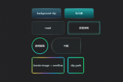
<p class="flex-wrap">
<!-- 方法一:background-clip :content-box, border-box,背景无法透明-->
<div class="flex-column j_c">background-clip</div>
<!-- 方法二:伪元素叠加,背景无法透明 -->
<div class="flex-column j_c">伪元素</div>
<!-- 方法三 :mask遮罩 背景色带透明 -->
<div class="flex-column j_c">mask</div>
<!-- mask遮罩 背景透明 -->
<div class="flex-column j_c">背景透明</div>
<!-- mask遮罩 背景透明 -->
<div class="flex-column j_c">透明圆角</div>
<div class="flex-column j_c">半圆</div>
<!-- 方法四:border-image + overflow: hidden 边框内不是圆角 -->
<div class="flex-column j_c">border-image + overflow</div>
<!-- 方法五:clip-path 边框内不是圆角-->
<div class="flex-column j_c">clip-path</div>
</p>
</body>
|  code前端网
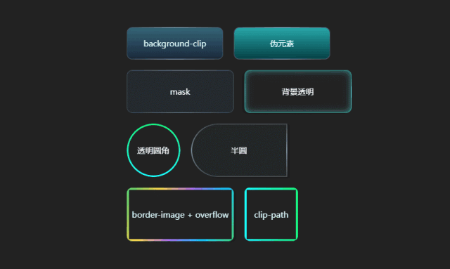