code前端网
CSS实践:在混合和混合模式下使用混合元素的占位符交互
占位符交互
特殊效果:当输入字段处于焦点状态时,动画中输入字段占位符的内容移动到左上角一个标题。使用 :placeholder-shown 伪类,您只需使用 CSS 即可实现此效果。
<div class="input-box">
   <input class="input-control input-outline" placeholder="账号">
   <label class="input-label">账号</label>
</div>
复制代码首先,让默认的占位符浏览器效果不可见
.input-control:placeholder-shown::placeholder {
    color: transparent;
}
复制代码其次,使用.input-label元素替换原来的占位符
.input-box{
  position: relative;
}
.input-label {
  position: absolute;
  left: 16px; top: 14px;
  pointer-events: none;
}
复制代码
最后,放入 当输入字段已定向并且栅栏未显示时的元素。效果是缩小它,移动到顶部
.input-control:not(:placeholder-shown) ~ .input-label,
.input-control:focus ~ .input-label {
  color: #2486ff;
  transform: scale(0.75) translate(-2px, -32px);
}
复制代码
效果如下:
使用mix-blend-mode混合元素
使用属性mix-blend-mode可以不仅可以混合图像,还可以将元素的文本和边框与容器的背景图像混合。
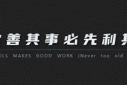
目标是为图片添加标题:
<div class='blend'>
  <h1>熊出没</h1>
</div>
复制代码
添加h1样式,最终效果是红色实心背景线,浅灰色顶部和底部宽边框。然后应用融合混合模式,整个元素被视为与下面容器中的背景图像混合在一起的图层。
.blend{
  background-image: url('image');
  background-size: cover;
  background-position: center;
}
.blend > h1{
  mix-blend-mode: hard-light;
  background-color: #c33;
  color: #808080;
  border: 0.1em solid #ccc;
  border-width: 0.1em 0;
}
复制代码
效果如下: 合并后的效果很有趣,文字看起来是透明的,好像红色横幅被剪掉了一样。这里我们使用混合模式
强光和中灰色文本颜色。当使用非常浅或非常暗的颜色时,对比度混合模式效果更好。
作者:zhangwinwin
版权声明
本文仅代表作者观点,不代表Code前端网立场。
本文系作者Code前端网发表,如需转载,请注明页面地址。
相关文章