code前端网
CSS 背景图像 7 个有用的提示和代码示例
背景图像可能是我们所有前端开发人员在我们的职业生涯中至少使用过几次的 CSS 功能之一。大多数人认为壁纸不会有什么异常,但经过调查,答案是否定的。本文收集了我认为最有用的七个技巧,并创建了一些代码示例。
1。背景图片如何完美适应视口?
背景图像很容易调整到视口。您必须使用以下 CSS:
body {
  background-image: url('https://images.unsplash.com/photo-1573480813647-552e9b7b5394?ixlib=rb-1.2.1&ixid=eyJhcHBfaWQiOjEyMDd9&auto=format&fit=crop&w=2253&q=80');
  background-repeat: no-repeat;
  background-position: center;
  background-attachment: fixed;
  background-size: cover;
  -webkit-background-size: cover;
  -moz-background-size: cover;
  -o-background-size: cover;
}
复制代码
案例来源:codepen.io/duomly/pen/…
2。如何在CSS中使用多个背景图片?
如果我想在背景中添加多张图像怎么办? CSS3中可以直接指定多个背景路径,如下所示:
body {
  background-image: url(https://image.flaticon.com/icons/svg/748/748122.svg), url(https://images.unsplash.com/photo-1478719059408-592965723cbc?ixlib=rb-1.2.1&auto=format&fit=crop&w=2212&q=80);
  background-position: center, top;
  background-repeat: repeat, no-repeat;
  background-size: contain, cover;
}
复制代码
案例源码:codepen.io/duomly/pen/…
3。如何创建三角形背景
另一种很酷的背景 一种特殊效果是三角形背景,如果我们想展示一些完全不同的选项,例如白天和黑夜或冬天和夏天,那就更好了。
的想法是首先创建两个div,然后向它们添加两个背景,然后第二个div使用♸路径关系绘制三角形。
「html」
<body>
  <div class="day"></div>
  <div class="night"></div>
</body>
复制代码
「css」
body {
  margin: 0;
  padding: 0;
}
div { 位置:绝对;高度:100vh;宽度:100vw; }
.day { 背景图片: url("images.unsplash.com/photo -14779...");背景大小:封面;背景重复:不重复; }
复制代码 有时候我们想在背景中添加文字,但有些图片太亮,文字看不清楚,所以我们需要在背景图片上叠加深色音乐来突出文字效果。 例如,可以通过添加粉橙色渐变或红色到透明渐变来增强日落图像。这些情况很容易通过叠加渐变来完成。 ?如果某种颜色更适合背景图像,动态改变背景颜色的技术就非常有用。 『css』 @-webkit-keyframes 背景覆盖动画 { 0% { 背景图像: 线性渐变(4deg, rgba(255,78,36,0.3) 50%, rgba(255) 78,36,0,3) 100%) url("images.unsplash.com/photo-15593..."); } 25% { 背景图像: 线性渐变(4度, rgba(213,49,127,0,3) 50%, rgba(213,49,127,0,3) 100%), url("images.unsplash.com /照片- 15593…”); } 50% { 背景图像:线性渐变(4deg, rgba(36,182,255,0.3) 50% , rgba(36,182,255,1) 100%), url("images.unsplash.com/photo-15593…"); } 100% { 背景图像: 线性渐变(4deg, rgba(0,255,254,0.3) 50%, rgba(0,255,254,0.3) 100%), 有时我们会遇到需要艺术或摄影的项目。他们通常需要网站上的艺术信息和创造力。互联网背景挺有创意的,效果如下: 「HTML」 「scss」 使用按钮 「HTML」 「SCSS」.night {
背景图片:url(“images.unsplash.com/photo-14935...”);
背景尺寸:封面;
背景重复:无重复;
剪裁路径:polygon(100VW 0,0%0vh,100vw 100vh);♹代码)代码:codepen.io/duomly/pen/…4。如何向背景图像添加叠加渐变?
HTML CSSResult
EDIT ON
@keyframes background-overlay-animation {
0% {
background-image:
linear-gradient(4deg, rgba(255,78,36,0.3) 50%, rgba(255,78,36,0.3) 100%), url("https://images.unsplash.com/photo-1559310589-2673bfe16970?ixlib=rb-1.2.1&ixid=eyJhcHBfaWQiOjEyMDd9&auto=format&fit=crop&w=2250&q=80");
}
25% {
background-image:
linear-gradient(4deg, rgba(213,49,127,0.3) 50%, rgba(213,49,127,0.3) 100%), url("https://images.unsplash.com/photo-1559310589-2673bfe16970?ixlib=rb-1.2.1&ixid=eyJhcHBfaWQiOjEyMDd9&auto=format&fit=crop&w=2250&q=80");
}
50% {
background-image:
linear-gradient(4deg, rgba(36,182,255,0.3) 50%, rgba(36,182,255,1) 100%),
url("https://images.unsplash.com/photo-1559310589-2673bfe16970?ixlib=rb-1.2.1&ixid=eyJhcHBfaWQiOjEyMDd9&auto=format&fit=crop&w=2250&q=80");
}
100% {
background-image:
linear-gradient(4deg, rgba(0,255,254,0.3) 50%, rgba(0,255,254,0.3) 100%),
url("https://images.unsplash.com/photo-1559310589-2673bfe16970?ixlib=rb-1.2.1&ixid=eyJhcHBfaWQiOjEyMDd9&auto=format&fit=crop&w=2250&q=80");
}
}
复制代码复制代码
源码:codely.铅笔/…6。如何制作网格壁纸?
<body>
<div class="container">
<div class="item_img"></div>
<div class="item"></div>
<div class="item_img"></div>
<div class="item"></div>
<div class="item"></div>
<div class="item_img"></div>
<div class="item"></div>
<div class="item_img"></div>
<div class="item"></div>
<div class="item"></div>
<div class="item_img"></div>
<div class="item"></div>
<div class="item_img"></div>
<div class="item"></div>
<div class="item_img"></div>
<div class="item"></div>
</div>
</body>
复制代码body {
margin: 0;
padding: 0;
}
复制代码.container {
position:absolute;%100; 高度:100%;
背景:黑色;
屏幕:网格;
网格模板列:25fr 30fr 50fr 50fr 40fr fr 30fr;
网格间距:2 0px;
.item_img {
背景图像:url('images.unsplash.com/photo-14998…'); 背景位置 } 7.如何将背景图片设置为文字颜色? 背景图像和背景剪辑为您的文本实现美丽的背景图像效果。在某些情况下,这可能非常有用,特别是当我们想要创建更大的文本标题而不像普通颜色那样无聊时。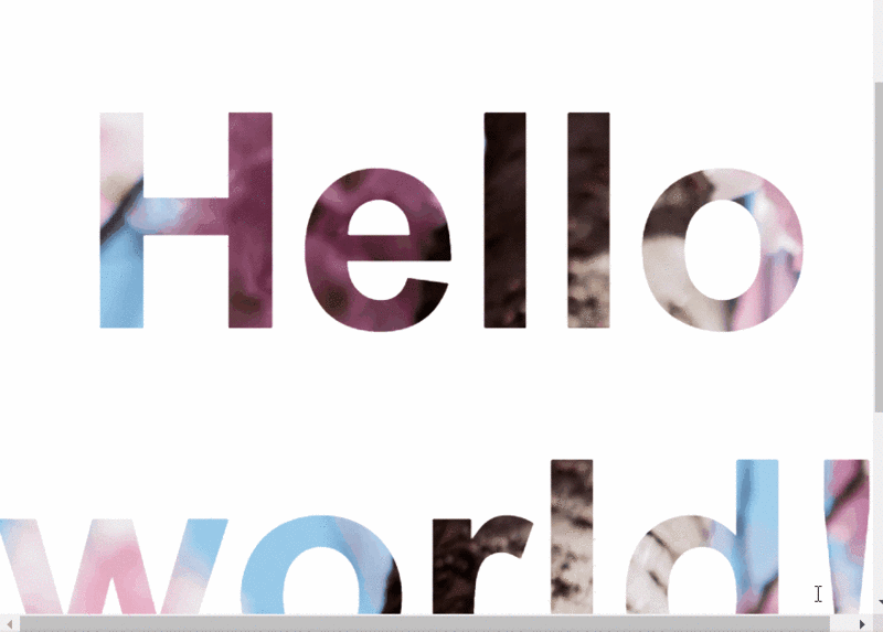
<body>
<h1>Hello world!</h1>
</body>
复制代码body {
display: flex;
align-items: center;
justify-content: center;
flex-direction: column;
width: 100%;
text-align: center;
min-height: 100vh;
font-size: 120px;
font-family:Arial, Helvetica, sans-serif;
}
复制代码h1 {
背景图像:url(“images.unsplash.com/photo-14622...”);❀c:文本? 链接:https://juejin.im/post/5ec32182e51d454dea6feeb8
来源:掘金
版权归作者所有。商业转载请联系作者获取授权。非商业转载请注明出处。
版权声明
本文仅代表作者观点,不代表Code前端网立场。
本文系作者Code前端网发表,如需转载,请注明页面地址。